-
MSM Legal – Company Logotype
-
Iniquity Single Malt Whisky – Branding
-
Mad Consulting Solutions – Company Logotype
-
Adelaide Eisteddfod Society – Company Logo
-
Saint-Clar Estate – Company Logotype
-
Iguana Creative – Company Logotype
-
Murray Fielder Caravan Park Broker – Company Logotype
-
CARE Distributors – Company Logotype
-
LeetGeek – Company Logotype & Brand Guide
-
S. Kidman & Co. – Beef Branding
-
The Smiths Personal Training – Company Logotype
-
iRecruit People Solutions – Company Logotype & Brand Guide
-
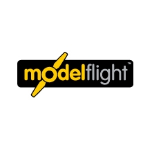
Model Flight – Company Logotype & Brand Guide
-
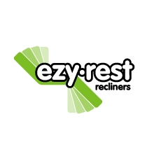
EzyRest Recliners – Company Logotype
-
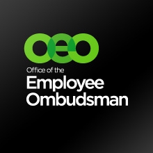
Office of the Employee Ombudsman – Corporate Logotype & Brand Guide
-
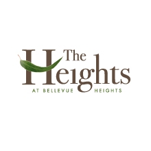
The Heights Retirement Village – Corporate Logotype
-
CliffTop Health Centre – Company Logotype
-
Quattro Mano – Company Logotype
-
Philippe Morin French Oak Cooperage – Company Logotype
-
View the identity Archive